 Secabo heat presses.
 Stahls heat presses.
DTF film 60cm/100m — see the offer
Stahls heat presses.
DTF film 60cm/100m — see the offer
Have you ever designed a graphic that looked strikingly vivid on screen, only to find the colors on the printed t-shirt slightly different — darker, or less intense? That is not a printing mistake, it is physics: a screen and a printer create color in two completely different ways. In this guide we explain, in plain language, how our DTF printer reproduces color, why we recommend preparing your artwork in CMYK, and exactly what to expect if you send us an RGB or PANTONE file.
The screen of your computer or phone is made of millions of tiny dots that emit light in three colors: Red, Green and Blue — hence the name RGB. Mixing these three lights produces every other color: red and green together make yellow, all three make white, and with all three switched off you see black. This kind of mixing is called additive — the lights add up.
That is why RGB is the natural "language" of everything viewed on a screen: photos from your phone, images from the web, designs from Photoshop or Canva. RGB can also display extremely saturated, almost glowing colors — because a screen literally shines.
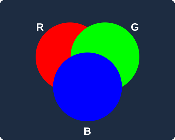
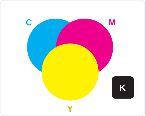
A print does not emit light — we see its color because the ink absorbs part of the light and reflects the rest back to our eyes. Printing therefore uses the opposite, subtractive model: Cyan, Magenta, Yellow and K (Key — black). The more ink we lay down, the more light is absorbed and the darker the color becomes.
Our DTF printer, the Hanrun Super A-604, prints with exactly these four inks, plus White ink printed underneath the design as a base layer — thanks to it, colors stay vivid even on black and dark garments.
In theory, mixing cyan, magenta and yellow would give black — but in practice the result is a muddy dark brown. That is why black is a separate ink: it delivers deeper blacks, sharper text and cleaner fine detail.
The set of all colors a device can display or print is called its gamut. In the picture below, the colored horseshoe represents every color the human eye can see, the solid white triangle the colors a typical screen can show (sRGB), and the dashed line the colors that can be printed with CMYK inks. The green dot is an example of a saturated on-screen color that the RIP has to pull toward the nearest printable shade (orange arrow):

The RGB gamut of a screen is noticeably wider than the CMYK gamut of print. The difference is biggest for highly saturated greens, turquoises, purples and oranges — a screen can display them, but no combination of CMYK inks can physically reproduce them at full intensity.
Fluorescent ("neon") colors sit far outside the CMYK gamut — they would require special fluorescent inks that standard DTF printing does not use. On the print, an on-screen neon green or neon pink will be replaced by the closest shade — still very vivid, but not "glowing".
A printer on its own does not know what to do with your file — everything is handled by the RIP software (Raster Image Processor), the "brain" of every professional printing setup. We use DevStudio DTF RIP, built specifically for DTF technology.
When we receive your PDF, the RIP takes every color in the file — whether RGB, CMYK or PANTONE — and, using an ICC profile, calculates the closest color our printer can actually put down. Think of an ICC profile as a precise "dictionary" for translating between color systems, created by measuring our exact printer, ink and film. PANTONE shades are recognized through the RIP's built-in PANTONE libraries and translated the same way.

In practice: colors inside the CMYK gamut are reproduced very accurately, while colors outside it are pulled by the RIP to the nearest printable shade — a process called gamut mapping. This is exactly why extremely saturated on-screen colors look slightly calmer in print.
An ICC profile is only as good as the measurements it was built from. We calibrated our printing with X-Rite measuring instruments: we printed test charts with hundreds of color patches, measured every patch with the instrument, and built the profile the RIP now uses to translate colors.
Crucially, we did not measure prints on paper or bare film, but finished transfers applied to real t-shirts — printed with our branded ink, on our DTF film roll and with our DTF powder. Every one of those elements affects the final color: the tint and coating of the film, the powder that bonds the print, the pressing temperature and pressure, and the fabric itself. By calibrating the whole chain — not just the printer — what we measured and profiled truly matches what you will get on the shirt.

If you prepare your artwork in CMYK (ideally with a standard profile such as Coated FOGRA39), what you see in your software will be very close to the final print — no surprises. If you send RGB, leave the conversion to our RIP: the calibrated profile will give a better result than a manual conversion to CMYK without a profile.
Upload your print-ready PDF, choose the number of copies and see the price instantly — our calibrated RIP will take care of the colors.

 Upload PDF
 DTF Designer